
One process of assessing a website’s search engine optimization (SEO) elements and performance using the SEO audit Screaming Frog tool.
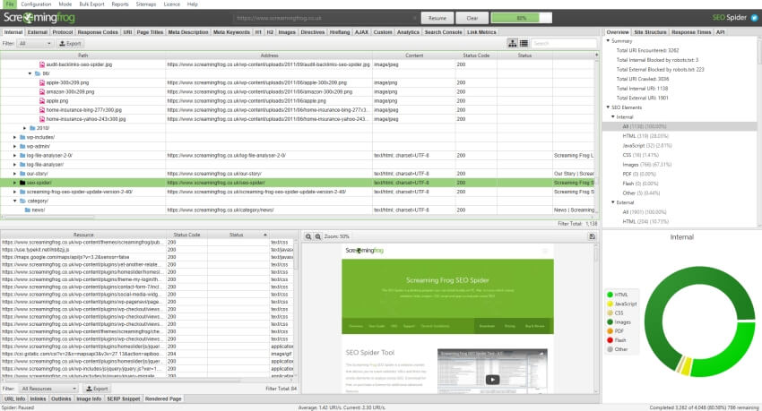
Screaming Frog SEO Spider is a popular desktop application used by digital marketers, SEO professionals, and website owners to crawl websites and gather valuable data for SEO analysis.
With SEO Audit Screaming Frog as our guiding beacon, we explore how this tool can elevate your digital strategy with precise insights.
In the ever-evolving landscape of online marketing, understanding SEO Audit Screaming Frog can be a game-changer.
This tool equips you with the ability to analyze your website meticulously, pinpoint critical issues, and optimize its performance.
Imagine having the power to unravel hidden opportunities and identify potential pitfalls with just a few clicks.
With our guidance, you’ll learn how to harness the full potential of SEO Audit Screaming Frog.
You could be a seasoned digital marketer or a business owner aiming for a robust online presence. This great information we are about to unravel is for you.
We simplify the complexities of SEO audit using Screaming Frog, providing you with practical tips and tricks to enhance your website’s user experience and boost search engine rankings.
Join us on this journey, and let’s elevate your digital strategy together using the precise insights offered by SEO Audit Screaming Frog.
Understanding the Significance of SEO Audit Screaming Frog
When it comes to optimizing your website for search engines, a comprehensive SEO audit is crucial.
It allows you to identify areas that need improvement, uncover technical issues, and ensure your website is properly optimized.
This is where SEO Audit Screaming Frog comes into play. This powerful desktop application crawls your website, collecting valuable data that can be used to analyze and optimize your SEO strategy.
The significance of SEO Audit Screaming Frog lies in its ability to provide you with precise insights into your website’s SEO elements.
By crawling your website, it collects information on various aspects such as title tags, meta descriptions, header tags, URLs, images, and more.
This data can then be analyzed to identify areas that need attention, such as missing or duplicate tags, broken links, or slow-loading pages.
With this information at your fingertips, you can make informed decisions to improve your website’s search engine rankings and overall performance.
Setting Up Your First SEO Audit Screaming Frog
Before diving into the world of SEO Audit Screaming Frog, it’s essential to set up the tool properly.
The first step is to download and install the Screaming Frog SEO Spider from the official website.
Once installed, you’ll need to input your website’s URL into the tool’s interface. This will initiate the crawling process, where Screaming Frog will systematically analyze your website’s pages and gather data.
To ensure that Screaming Frog captures all the necessary data, it’s crucial to configure its settings correctly.
The tool allows you to customize various parameters, such as the maximum number of URLs to crawl, the crawl speed, and the user agent. When you adjust these settings, you can optimize the crawling process to suit your specific needs and website characteristics.
Once the crawl is complete, you’ll be presented with a wealth of data about your website’s SEO elements. The information is organized in a structured manner, making it easy to navigate and analyze.
From here, you can delve into each aspect of your website, identify areas for improvement, and devise a strategy to enhance your SEO performance.
Analyzing Website Elements with SEO Audit Screaming Frog
Now that you have your SEO Audit Screaming Frog set up and ready to go, it’s time to dive deep into analyzing your website’s elements. Let’s explore some of the key areas you should focus on.
Metadata Analysis
Metadata plays a crucial role in SEO. It provides search engines with information about your website’s content, helping them understand its relevance to user queries.
With SEO Audit Screaming Frog, you can analyze various metadata elements, such as title tags, meta descriptions, and heading tags.
You can ensure that your metadata is optimized for target keywords, accurately representing your content, and enticing users to click through to your website.
Robb Fahrion also added that:
To improve your website’s SEO, it’s important to have a proper meta-title and meta-description for each page. This provides Google with more information to understand the entire website as a whole. So, make sure to fill your website with plenty of content for Google to analyze.
Thankfully, SEO Audit Screaming Frog can help you achieve that.
URL Structure Evaluation
A well-structured URL can have a significant impact on your website’s SEO. It not only helps search engines understand the hierarchy and organization of your content but also provides users with a clear indication of what to expect.
With SEO Audit Screaming Frog, you can review your website’s URLs and identify any issues, such as lengthy or irrelevant URLs, missing keywords, or duplicate URLs. You can improve both search engine visibility and user experience.
Image Optimization Assessment
Images are an integral part of any website, but they can also impact your SEO efforts. With SEO Audit Screaming Frog, you can analyze your website’s images and ensure they are optimized for search engines.
This includes reviewing image alt tags, file names, and file sizes. By optimizing these elements, you can improve your website’s accessibility, enhance its load speed, and increase the likelihood of image search visibility.
Content Analysis
Content is king in the world of SEO, and analyzing your website’s content is crucial for success. With SEO Audit Screaming Frog, you can review various aspects of your content, such as word count, keyword density, and internal linking.
You can identify opportunities to optimize your content for target keywords, improve its readability, and enhance its overall quality by analyzing these factors.
Monitoring and Reporting with SEO Audit Screaming Frog
While analyzing your website’s elements is essential, it’s equally important to monitor your SEO performance and track your progress over time.
SEO Audit Screaming Frog offers robust monitoring and reporting capabilities to help you stay on top of your SEO game.
The tool allows you to schedule regular crawls of your website, ensuring that you’re always up to date with any changes or issues.
By tracking these crawls, you can monitor the impact of your SEO efforts and make data-driven decisions to optimize your website further.
Additionally, SEO Audit Screaming Frog provides detailed reports that summarize the findings of each crawl. These reports can be exported in various formats, such as CSV or PDF, making it easy to share the information with stakeholders or clients.
The reports offer valuable insights into your website’s SEO health, highlighting areas of improvement and tracking your progress over time.
Elevating Your Digital Strategy with SEO Audit Screaming Frog
Having a robust digital strategy is crucial for success. SEO Audit Screaming Frog empowers you with precise insights to enhance your website’s user experience and boost search engine rankings.
When you understand the significance of SEO Audit Screaming Frog, setting up your first audit, analyzing website elements, and leveraging the monitoring and reporting features, you can take your digital strategy to new heights.
Whether you’re a seasoned digital marketer or a business owner aiming for a robust online presence, SEO Audit Screaming Frog is a valuable tool in your arsenal.
With its ability to provide comprehensive website analysis, automate the auditing process, and offer actionable insights, this tool is a game-changer in the world of SEO.
Together, we can enhance your digital strategy by utilizing the accurate insights provided by SEO Audit Screaming Frog.
FAQs
What is Screaming Frog SEO Spider, and why is it important?
Screaming Frog SEO Spider is a vital desktop tool used by marketers and website owners to analyze and optimize websites. It’s crucial for identifying issues and improving online performance.
How does SEO Audit Screaming Frog differ from other SEO tools?
SEO Audit Screaming Frog offers in-depth website analysis, customizable filters, and competitor site comparison. Its advanced features make it a powerful choice for professionals.
Is SEO Audit Screaming Frog suitable for beginners?
Yes, the tool caters to users of all levels. The blog simplifies its usage, making it accessible and beneficial for both beginners and experienced marketers.
What issues can SEO Audit Screaming Frog identify?
It can find broken links, duplicate content, slow-loading pages, and other on-page SEO issues, helping optimize website structure and user experience.
What are the next steps after conducting an SEO audit with Screaming Frog?
After conducting a comprehensive audit, it is crucial to promptly implement necessary improvements. Focus on tasks like fixing broken links, optimizing content structure, and enhancing overall user experience. These enhancements not only boost search engine rankings but also ensure that the blog serves as an invaluable resource, providing practical and actionable guidance to users seeking to improve their online experience.