Ever wondered why your website fails to convert despite a brilliant marketing campaign? You have ensured powerful content and combined them with high quality visuals. But your page fails to make the desired impact!
Well, chances are your call-to-action (CTAs) game is not as strong as you think.
To craft compelling CTAs, it’s vital to know the characteristics that make them stand out. However, before diving into the mechanics of what makes a strong CTA, let’s understand why it’s an essential element in the marketing world.
What is a CTA?
CTA, or a call-to-action, is a magnet that attracts the audience and compels them to take the desired action. It is the final nudge that has the power to encourage visitors to turn into potential customers and, finally, a sale! Bingo. All marketers know what captivating CTA can do, yet many websites need help to convert leads into customers due to weak CTAs.
As if this was not bad, 70% of B2B small businesses don’t have a CTA on their homepage.
If you don’t want to be categorized in the above figure, all you have to do is take some time out to focus on creating high-converting CTAs. To help you, we have curated below the five proven tips to boost your sales.
5 Tactics to Create a Compelling Call to Action
When it comes to CTA, there is on one size fits all structure. Finding a compelling CTA for your website, marketing campaign, or advertisement is an ongoing journey to see what works for your business. Yet here are some best tips that will help you craft effective CTAs that give your visitors the right prompt at just the right moment to seal the deal.
-
Be Clear and Precise
Long texts, analogies, and metaphors all seem nice when it’s part of the content. But when the question in discussion is a call to action, the game changes 360 degrees. At its core, the sole purpose of the CTA is to entice users to take action, so the clearer it is, the better the conversion.
Whether it’s joining a newsletter, subscribing to an email, or making a purchase, visitors come to your platform for two main reasons: entertainment or information. Regardless of their goal, you must have a CTA that clearly instructs what to do once they land on your website.
Having a straightforward call to action not only simplifies things for your customers but also removes any ambiguity that might lead to confusion, resulting in you losing an opportunity to make a sale.
Just take the example of the clear CTA present on the Amazon Prime website. They have two CTAs on their landing page to instruct visitors on what possible actions they can take.
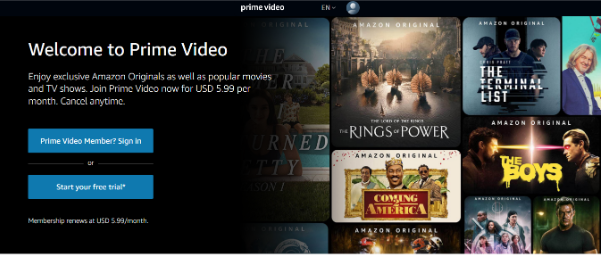
For instance, if you’re new on Prime and want to test the collection before buying, you can select the “Start your free trial” button. Similarly, the other call to action, “Prime Video Member, Sign in,” is a direct call to Prime users to avail this service.
-
Use Action-Oriented Language
We all know that “actions speak louder than words,” and while there is nothing new in this phrase, this small sentence significantly impacts the CTA world. You can describe your product with all the fancy words and images, but what good is it if you don’t tell your customers how to proceed further?
Using action-oriented text in a call to action does wonders, enticing customers to take the desired action. Words like “Buy,” “Join,” and “Start” hold more weight than boring, plain words like “Enter,” “Request,” and “Submit.” Ensure that your CTA is direct and persuasive and that it sparks attention.
Some trendy persuasive words that make high-converting CTAs are:
- Free
- Instantly
- Today
- Now
- Bonus
- Limited
- New
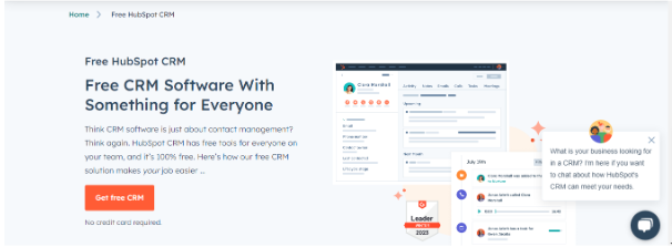
Take a look at this picture. Hubspot’s platform is ever-growing, thanks to its brilliant marketing strategy that yields remarkable results. Its call to action is simple yet mighty as it instantly grabs the audience’s attention, thanks to the word “Free.”
The whole purpose of crafting a CTA is to drive conversions, so what better way than to use an action-packed text that lets users know that you’re bringing something to them and are not just bluffing?
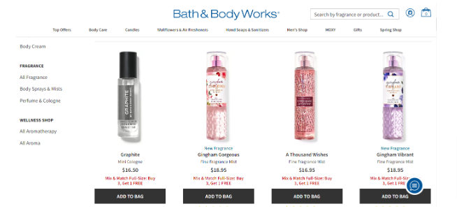
Bath & Body Works’ website features a direct CTA “Add to bag” that tells the customers what actions they should take if they are interested in buying a mist from their site. Clear, to-the-point instructions are helpful as they don’t beat around the bush and take directly to the ultimate goal, i.e. sales.
-
Keep it Short
Did you know the most effective CTAs are two to five words long? Amazing, right? It’s because, as a marketer, your ultimate goal is to boost sales. Words hold power when they are scarce. Too many of them, and there would be a mess as it might pose problems with your design, button, or anything else that causes more harm than good.
Crafting a CTA that is clear and short is no tough feat. However, if you’re still worried and think you can’t do this, it’s best to devise several calls to action. Experiment with them by arranging and rearranging them to determine which words are absolutely necessary. Eliminate the ones that you deem unimportant. Remember, the goal is to get the message across in as simple words as possible so that the desired action can be taken.
For instance, let’s say you landed on two different pages which have these CTAs
“Start your trial today to enjoy exclusive offers”
“Get started”
Ask yourself, which CTA you found more attractive? An eight worded or two? The second one is more powerful in this case as it’s short and precise. It encourages you to take action and gives you the much-needed push.
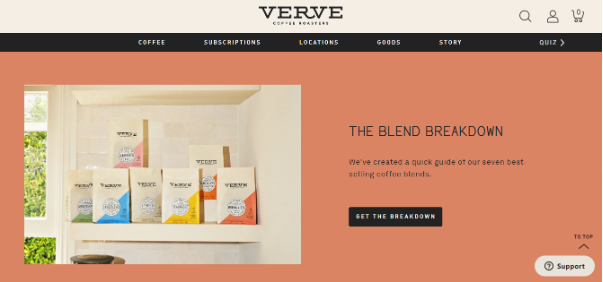
The Verve coffee brand features a call to action titled “Get the breakdown.” It’s action-oriented, short, and specific that clearly tells the visitor that if they wish to know what their coffee blends contain, they have to click on this CTA to know all the details.
-
Evoke Urgency
If you want to ensure sales, use a CTA that has the power to evoke emotions. Think of urgency and scarcity as two pillars of persuasion. Together they create an environment that encourages visitors to act.
Urgency refers to something that is time sensitive and requires your immediate attention. On the other hand, scarcity indicates that something is limited, popular, and in high demand, so you must act before the ball is in someone else’s court.
These two factors create a feeling of FOMO (fear of missing out), a powerful motivator that skyrockets sales. The fear that you’ll miss out triggers the human psychological response of getting it as soon as possible if they want to avail the valuable opportunity.
CTAs like “claim your offer,” “hurry,” ” don’t miss,” “last chance,” and “exclusive offer” are some popular examples that instill the feeling of losing in the customers. It tells them that there will be consequences if they don’t take immediate action, and this tactic works like magic.
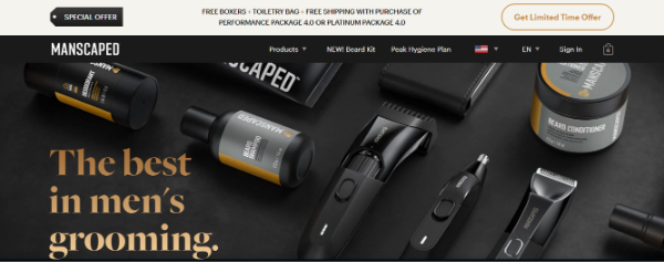
Take this example from Manscaped. Here they are executing their special offer with the CTA “Get limited time offer,” which grabs the audience’s attention and creates a sense of urgency among the visitors. It’s telling its users that if they don’t take up this offer, they might miss out on a golden opportunity as it won’t stick for long.
However, there is a very fine line between creating urgency and being pushy. Build up on what you are offering, outline the benefits, and tell your customers why it’s important. Don’t try to guide them to CTA immediately, or you’d come across as someone who’s only trying to make money (sales). Be clear and direct, but don’t go overboard by repeatedly priming your visitors with CTAs.
One factor that can affect your urgency game is the credibility. Your audience need to trust you. For this to happen, you must understand your target audience and what they need. Imagine yourself in their shoes and ask what you would have wanted if you landed on this (your website) page.
This would give you an idea of what your target audience requires, and you can then tweak your services or products to cater to their wants.
For instance, take a look at the Bark Box website.
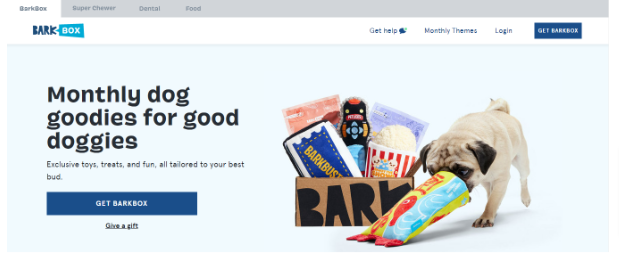
The owner here clearly knows that the target audience falls into two categories. One where people would be buying stuff for their dogs and another where they would be looking to send something to a loved one who enjoys furry babies, as not everyone has a dog in their house. Barkbox makes use of an action-oriented CTA, such as “get bark box” and “give a gift,” that caters to its target audience well.
-
Interactive CTA’s
Marketers these days understand the importance of connecting with their potential customers. They know advertising alone isn’t going to generate leads if your audience doesn’t feel included. Recently, a shift has been seen where the focus of copywriting has been redirected to users. One such way of doing this is employing first-person language in a call-to-action.
When a CTA is written in the first-person language, the connection with the audience is on a different level. For instance, let’s look at the two call-to-action phrases below.
“Download your free e-book”
“Download my free e-book”
Which of these can you resonate with more? Obviously, the second one is because it gives the impression of being included. It creates the feeling of being seen. Brands leverage this technique in their CTA, and the results are phenomenal, as there has been a 90% increase in click-through rates.

Take the above example of how you can incorporate first-person CTA’s on your website. The brand Optinmonster has two CTAs on its website that are clear and precise. Using first-person language, like “Yes, I want more subscribers!” creates a sense of ownership and commitment in the user. It also reinforces that the brand is indeed offering value that is going to be useful for the business.
Conclusion
By now, you know all the tricks and tips you can leverage to craft compelling, result-oriented CTAs. Keep these characteristics in mind, and experiment with different calls to action to determine what works best for your business. Remember, there is no magic rule. But with these proven tips, you can connect better with your audience, which will ultimately help in driving conversions.